Tag Archive for: User Experience

If you’re using WordPress and WooCommerce to power your online store, customising “Add to Cart” functionality can greatly enhance the user experience and streamline the checkout flow. As a marketing consultant who specialises in WordPress website and WooCommerce stores, I have found myself ‘googling’ the term “Custom Add to Cart URLs” more times than I can count. It’s a fantastic feature that I frequently use in my own businesses, as well as on my clients’ websites.

That’s why I wanted to share it on the Done Digital blog and provide you with a simple but comprehensive guide to custom add to cart links. I’ll walk you through the exact process of creating your custom WooCommerce links and buttons that you can customise to suit your specific needs and use case cases. Whether you’re dealing with simple products, variable products, or grouped products, these custom links allow you to effortlessly add products to the cart, redirect customers to specific pages, and even set custom quantities—all using simple URLs.

While there are many use cases for custom URLs inn various contexts, in this article, I’ll just focus on custom add-to-cart URLs for your WooCommerce store. So, let’s dive right in!

Where to Find Product IDs in WooCommerce

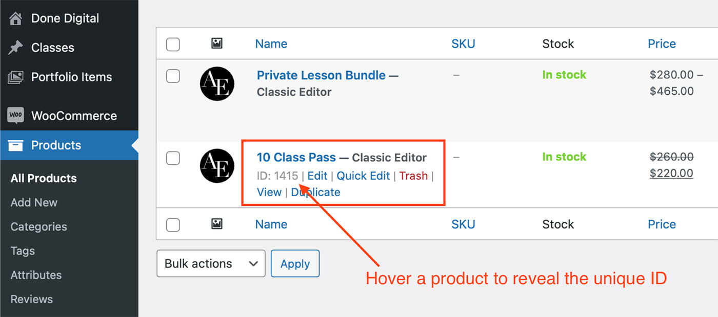
In order to create your custom URLs, you’ll need the unique product IDs of the products you want to include in the link. Here’s where to easily locate your product IDs in WooCommerce.

How to locate product IDs in WooCommerce to create custom add to cart URLs for your online store - Done Digital

Adding Simple Products to Cart with Custom WooCommerce Links

With simple products, adding them to the cart via a custom URL is a breeze. Here’s how to generate the URLs and specify quantities. Whether you want to redirect customers to the cart, checkout, or any other page, you’ll have full control over the customer journey.

Let’s look at some practical examples:

Custom URL to Add a Simple Product to Cart

This is great if you want to place a simple add-to-cart button or link anywhere on your website:

https://yourwebsite.com/?add-to-cart=25&quantity=1

URL to Add 2 of the Same Simple Products to Cart

You can change the quantity add the end of your URL to control how many items of that same product are added to the cart:

https://yourwebsite.com/?add-to-cart=25&quantity=2

Add a Simple Product to Cart and Send the User Directly to The Cart Page

In some instances, you might want to send the user to the cart page after the product is added. Here’s how to do just that:

https://yourwebsite.com/cart/?add-to-cart=25&quantity=1

Send the User Directly to Checkout After Adding a Simple Product to Cart

This is probably the custom URL I personally use the most. This is great if you want to make sales from a landing page or any other page for that matter. By having users land straight on the checkout page after clicking the “Buy Now” button, you eliminate all friction and increase your conversion rates. Here’s how to build your custom URL:

https://yourwebsite.com/checkout/?add-to-cart=25&quantity=1

Redirect to Any Page After Adding a Simple Product to The Cart

You can further customise the above example and send users to any specific page after adding a product to their cart. This could be to up-sell items, have them register an account or to collect other important information before sending them to checkout.

https://yourwebsite.com/any-page/?add-to-cart=25&quantity=1

The above examples of custom WooCommerce URLs allow for incredible flexibility when it comes to designing your online buying journey and I have personally used them on many of my clients’ websites.

How to Add Variable Products to Cart Using Custom WooCommerce URLs

Variable products may have different variations, but they function in the same way simple products do. What’s important is that you use the correct product ID. In the case of variable products, we will be using the ID of the product variation, rather than the product itself. This allows you to craft custom URLs that add the desired product variation to the cart without having to navigate to the product page.

Just like in the examples above, you can still set quantities and redirect customers to different pages based on your desired outcome and customer journey.

Once again, we’ll use some practical examples that will make it easier to adapt these custom links to your website:

Add One Variable Product to Cart

https://yourwebsite.com/?add-to-cart=88&quantity=1

Add 2 or More of The Same Variable Product to Cart

https://yourwebsite.com/?add-to-cart=88&quantity=2

Change the quantity at the end of the URL to suit your needs.

Add One Variable Product to Cart & Redirect to Cart Page

https://yourwebsite.com/cart/?add-to-cart=88&quantity=1

Add One Variable Product to Cart & Redirect to Checkout Page

https://yourwebsite.com/checkout/?add-to-cart=88&quantity=1

Add One Variable Product to Cart & Redirect to Any Page

https://yourwebsite.com/any-page/?add-to-cart=88&quantity=1


If you are using variable products on your websites, these custom URLs can come in handy in streamlining your checkout process and enhancing the user experience. Depending on the WordPress theme you use, the generic product pages can be lacking quite a bit. These custom WooCommerce product links allow you to design your sales page exactly the way you want and send buyers directly to the checkout page.

Adding Grouped Products to Cart Using Custom Add-To-Cart URLs in WooCommerce

Next, let’s look at how to add grouped products to the cart, along with specific quantities for each sub-product. This feature allows you to create custom bundles and offer flexible purchasing options to your customers.

Add a Grouped Product to Cart

To create a custom URL for adding a grouped product to the cart in WooCommerce, you will need to retrieve the Grouped Product ID and the corresponding sub-product IDs. Let’s take an example:

https://yourwebsite.com/?add-to-cart=9876&quantity[5432]=3&quantity[6543]=2

In this scenario, the Grouped Product ID is 9876, and we are adding 3 units of the product with ID 5432 and 2 units of the product with ID 6543.

It’s important to remember that if you wish to add “zero” as the quantity for any of the sub-products, you still need to specify it explicitly. For instance, to add zero units of the product with ID 6543, you would simply use &quantity[6543]=0 in the URL.

Just ensure to replace “yourwebsite.com” with your actual domain name and adjust the product and quantity values based on your specific products and requirements.

And there you have it! By harnessing the power of custom WooCommerce Add to Cart URLs, you can significantly enhance the shopping experience on your WordPress website. Whether you’re a small local business selling a few items online or a large e-commerce store, custom checkout URLs empower you to create seamless customer journeys, increase conversions, and provide a user-friendly buying process that keeps your customers coming back.

What’s your experience with WordPress and WooCommerce? Have you used custom URLs on your website to enhance the checkout flow? Let me know in the comments below!

A captivating online presence is a necessity for businesses in today’s digital age, and crafting a captivating website plays a pivotal role in achieving this. Your website acts as the virtual storefront, making the initial impact on potential customers. By having a well-designed website, you can engage visitors and effectively communicate your brand’s message, values, and offerings. Throughout this article, we will explore the wonders of website design and uncover how it can transform your online presence, captivate your audience, and propel your business towards unprecedented success.

The Power of First Impressions

Just like a physical storefront, your website’s design has a significant impact on the first impression visitors have of your brand. Studies show that it takes mere seconds for users to form an opinion about a website. A professionally designed website with an aesthetically pleasing layout, intuitive navigation, and visually compelling elements can instantly captivate your audience and convey credibility and professionalism.

User Experience: Navigating with Ease

User experience (UX) is at the heart of effective website design. A seamless and intuitive navigation system ensures that visitors can easily find the information they need, effortlessly explore your products or services, and ultimately take the desired action. By creating a user-friendly website structure, you enhance the overall experience, reduce bounce rates, and increase the likelihood of conversions.

Visual Storytelling: Engaging with Impact

Humans are visual creatures, and a visually appealing website can make a lasting impact on visitors. Through thoughtful design elements such as high-quality images, captivating videos, and visually striking graphics, you can convey your brand’s story, evoke emotions, and create a memorable experience. Compelling visuals not only capture attention but also leave a lasting impression, increasing the likelihood of visitors becoming loyal customers.

Responsive Design: Optimised for Every Device

In today’s mobile-driven world, a responsive website design is essential. With the increasing use of smartphones and tablets, your website must adapt seamlessly to different screen sizes and resolutions. A responsive design ensures that your website looks and functions flawlessly across all devices, providing a consistent and enjoyable user experience. By optimising your website for mobile devices, you can reach a broader audience and maximise engagement.

Conversion-Focused Design: Driving Results

A well-designed website goes beyond aesthetics; it is a powerful tool for driving conversions. Through strategic placement of calls-to-action (CTAs), clear messaging, and persuasive content, you can guide visitors through the customer journey and encourage them to take specific actions, such as making a purchase, filling out a form, or contacting your business. By optimising your website for conversions, you can turn visitors into loyal customers and boost your bottom line.

The Role of Branding: Consistency is Key

Your website should reflect your brand’s identity and values consistently. Consistent branding across all elements, including colours, typography, imagery, and tone of voice, helps build brand recognition and trust. When visitors land on your website and experience a cohesive brand presence, they feel a sense of familiarity and connection. A strong and consistent brand presence fosters credibility, encourages engagement, and sets you apart from the competition.

Crafting a Captivating Website: Igniting Your Brand’s Online Presence - Done Digital Marketing, Brisbane

Build a strong brand: Define your identity, design a compelling logo, strategise your approach, and market effectively. Consistency and connection are key to establishing trust and standing out in a competitive landscape.

The Importance of Regular Updates: Staying Fresh and Relevant

A website is not a one-time investment; it requires regular updates and maintenance to stay fresh and relevant. Keeping your website up to date with the latest design trends, technology advancements, and relevant content ensures that it remains engaging and resonates with your target audience. Regular updates also contribute to improved search engine visibility, as search engines favour websites with fresh and valuable content.


Ready to take your online presence to new heights? Schedule a FREE Strategy Call with us and unlock the wonders of website design for your brand.

Crafting a captivating website design is a game-changer for businesses in the digital landscape. A well-designed website not only captivates visitors but also communicates your brand’s message, values, and offerings with impact. By prioritising user experience, visual storytelling, responsiveness, conversion-focused design, consistent branding, and regular updates, you can create a website that captivates your audience, drives business growth, and sets you apart from the competition.

Ready to witness the power of captivating website design? Take a moment to explore our portfolio of previous website creations. Immerse yourself in the visual wonders and see how our expertise in website design can transform your online presence. Let our success stories inspire you to envision the possibilities for your own brand.

A captivating online presence is a prerequisite for business success. As consumers increasingly rely on the internet to discover and engage with brands, the design of your website plays a critical role in shaping your online reputation. A well-crafted website not only attracts potential customers but also builds trust, credibility, and brand loyalty. In this article, we will explore the importance of crafting a captivating online presence through effective website design.

Now, let’s outline key points and lessons that business owners should consider creating a website that leaves a lasting impression on visitors and contributes to their overall online reputation.

Understanding the Impact of Website Design on Online Reputation

In the competitive online marketplace, your website is often the first point of contact between your brand and potential customers. The design of your website significantly impacts how visitors perceive your business and influences their decision to engage further. A poorly designed website can leave a negative impression, leading to a damaged online reputation. Conversely, a well-crafted and visually appealing website can evoke trust, credibility, and a positive perception of your brand.

User Experience and Navigation

A captivating online presence starts with a user-friendly website that provides a seamless browsing experience. Visitors should be able to navigate your website intuitively, find the information they need effortlessly, and have a pleasant interaction with your brand. By prioritising user-centric design principles, such as intuitive navigation, clear and organised content, and fast-loading pages, you can enhance user experience and keep visitors engaged.

Consistency in Branding and Messaging

Consistency in branding and messaging is crucial for creating a cohesive and memorable online presence. Your website should align with your brand identity, incorporating your brand’s colours, fonts, and visual elements. Consistent messaging throughout the website, reflecting your brand’s values, mission, and unique selling propositions, builds brand recognition, fosters trust, and contributes to a strong online reputation.

Compelling Visual Design

Visual design is a powerful tool to capture visitors’ attention and leave a lasting impression. Use high-quality images, videos, and graphics that resonate with your target audience and reflect your brand’s personality. Compelling visual elements should communicate your brand story effectively and evoke emotions that align with your brand values. A visually captivating website design enhances user engagement, encourages visitors to explore further, and establishes a positive online reputation.

Craft a captivating online presence for your brand through effective website design. Learn the key points, lessons and more in this article!

Mobile Responsiveness and Accessibility

With the increasing use of mobile devices, having a mobile-responsive website is no longer a luxury but a necessity. Your website should adapt seamlessly to different screen sizes, providing a consistent and optimised experience across devices. Additionally, prioritise accessibility features to ensure that individuals with disabilities can access and navigate your website easily. A mobile-responsive and accessible website demonstrates your commitment to inclusivity, improves user experience, and strengthens your online reputation.

Clear Call-to-Actions

A captivating website should guide visitors towards desired actions, whether it’s making a purchase, signing up for a newsletter, or contacting your business. Incorporate clear and strategically placed call-to-action buttons that prompt visitors to engage. Well-defined call-to-actions not only improve user experience but also increase conversions and contribute to a positive online reputation.

Wrap-up

Crafting a captivating online presence through effective website design is an essential endeavour for businesses in the digital age. Your website serves as a virtual storefront, influencing how potential customers perceive your brand. By prioritising user experience, consistency in branding and messaging, compelling visual design, mobile responsiveness, accessibility, and clear call-to-actions, you can create a website that engages visitors and establishes a positive online reputation. Remember, a captivating online presence sets the stage for business growth and success in today’s competitive marketplace.

Ready to create a captivating online presence for your brand? Contact Done Digital today and book a free strategy call. Don’t miss out on the opportunities that a captivating online presence can bring!

Discover eight effective ways to optimise your website for search engines and attract organic traffic!

In today’s digital age, having a strong online presence is crucial for the success of any business. One of the key factors in achieving online visibility is optimising your website for search engines. When your website is properly optimised, it becomes more visible to potential customers searching for products or services related to your industry. In this article, we will explore eight effective ways to optimise your website for search engines, helping you attract organic traffic, improve your search rankings, and drive business growth.

Conduct Comprehensive Keyword Research

Keywords are the foundation of effective website optimisation. Start by researching relevant keywords that are frequently searched by your target audience. Use keyword research tools like Google Keyword Planner or SEMrush to identify high-traffic and low-competition keywords. Incorporate these keywords strategically throughout your website’s content, including in page titles, headings, meta descriptions, and body text. By targeting the right keywords, you can increase your website’s visibility and attract qualified organic traffic.

Optimise On-Page Elements

On-page optimisation plays a significant role in improving your website’s search engine rankings. Ensure that your page titles, meta descriptions, and URLs contain relevant keywords. Create unique and descriptive meta tags for each page, highlighting the content’s relevance to the target audience. Optimise your website’s headings (H1, H2, H3, etc.) by including keywords and organising your content in a logical hierarchy. By optimising these on-page elements, search engines can better understand your website’s content and rank it accordingly.

Discover eight effective ways to optimise your website for search engines and attract organic traffic!

Create High-Quality and Engaging Content

Content is king when it comes to website optimisation. Develop high-quality, informative, and engaging content that resonates with your target audience. Incorporate relevant keywords naturally throughout your content but avoid keyword stuffing. Create blog posts, articles, and guides that address your customers’ pain points and provide valuable solutions. Include visual elements like images, infographics, and videos to enhance user experience. Valuable and shareable content not only attracts organic traffic but also encourages backlinks and social media engagement, which can boost your website’s authority and visibility.

Improve Website Loading Speed

Website loading speed is a critical factor in both user experience and search engine optimisation. A slow-loading website can result in higher bounce rates and lower search rankings. Optimise your website’s loading speed by compressing images, minimising code, and leveraging browser caching. Use a content delivery network (CDN) to deliver your website’s content quickly to users around the world. Regularly monitor your website’s loading speed using tools like Google PageSpeed Insights and make necessary improvements to ensure a fast and seamless user experience.

Optimise for Mobile Devices

With the increasing use of mobile devices, optimising your website for mobile is no longer optional but essential. Ensure your website is mobile-friendly and responsive, adapting seamlessly to different screen sizes and resolutions. Optimise your content and design elements to provide a smooth and user-friendly experience for mobile users. Mobile optimisation not only improves user experience but also boosts your search engine rankings, as search engines prioritise mobile-friendly websites in their mobile search results.

Build High-Quality Backlinks

Backlinks from reputable and relevant websites are a strong signal of your website’s authority and relevance. Implement a robust link building strategy to attract high-quality backlinks. Create valuable content that others in your industry will want to reference and share. Reach out to industry influencers, bloggers, and websites to request backlinks or guest blogging opportunities. Participate in online communities, forums, and social media platforms to build relationships and attract backlinks. High-quality backlinks can significantly improve your website’s search engine rankings and increase organic traffic.

Optimise for Local Search

If your business targets a specific local area, optimising your website for local search is essential. Register your business with Google My Business and other local directories. Ensure your business name, address, and phone number (NAP) are consistent across all platforms. Encourage customers to leave reviews, as positive reviews can boost your local search rankings. Additionally, consider joining local business directories and optimising your listings with consistent and accurate information.

Regularly Monitor and Analyse Performance

Optimising your website for search engines is an ongoing process. It’s crucial to regularly monitor and analyse your website’s performance to identify areas for improvement. Utilise tools like Google Analytics to track your website’s traffic, user behaviour, and conversion rates. Analyse keyword rankings and identify opportunities to optimise underperforming pages. Stay updated with the latest SEO trends and algorithm changes to adapt your optimisation strategies accordingly. By continuously monitoring and refining your website optimisation efforts, you can stay ahead of the competition and maintain a strong online presence.

Final thought

Optimising your website for search engines is a must-do for businesses seeking online success. By following these eight effective strategies, you can improve your website’s visibility, attract organic traffic, and drive business growth. Remember to conduct comprehensive keyword research, optimise on-page elements, create high-quality content, improve website loading speed, optimise for mobile, build high-quality backlinks, optimise for local search, and regularly monitor and analyse performance. By implementing these strategies and staying committed to ongoing optimisation, you can position your website for long-term success in search engine rankings.

Ready to optimise your website for search engines and drive organic traffic to your business? Contact Done Digital now! Reach out to us today and unlock the full potential of your website.

Unlock the potential of your website and drive measurable results! Discover proven strategies for increasing website conversion rates.

In the competitive landscape of online business, attracting visitors to your website is only half the battle. The true measure of success lies in converting those visitors into loyal customers. To achieve this, you need to optimise your website’s conversion rates—the percentage of visitors who take the desired action, whether it’s making a purchase, filling out a form, or subscribing to your newsletter. In this article, we will explore proven strategies that will help you increase your website conversion rates and drive tangible results for your business.

Streamline Your Website’s User Experience

The first step in improving your website conversion rates is to ensure a seamless and intuitive user experience. Visitors should be able to navigate your site effortlessly, finding the information they need and taking action without any roadblocks. Streamline your website’s design, making it visually appealing and easy to navigate. Use clear and concise language, guiding visitors through the conversion process with compelling calls-to-action. Remember, a smooth user experience builds trust and confidence, leading to higher conversion rates.

Optimise Landing Pages for Conversion

Landing pages are crucial elements of your website that directly impact conversion rates. To optimise your landing pages, ensure they are tailored to specific goals and target audiences. Craft compelling headlines and persuasive copy that clearly communicates the value proposition of your product or service. Use eye-catching visuals and testimonials to build trust. Additionally, minimise distractions by removing unnecessary links and elements that might divert visitors’ attention from the conversion goal.

Leverage the Power of Social Proof

Social proof is a powerful psychological phenomenon that influences people’s decisions. Incorporate social proof elements on your website to boost conversion rates. Display customer testimonials, reviews, ratings, and endorsements from trusted sources. Highlight the number of satisfied customers or successful transactions. By showcasing positive feedback and real-life examples of your product or service in action, you instil confidence in potential customers and increase their likelihood of converting.

Implement Clear and Compelling Calls-to-Action

Effective calls-to-action (CTAs) are crucial for driving conversions. Make your CTAs prominent, visually appealing, and easy to understand. Use action-oriented words that create a sense of urgency and excitement. Incorporate persuasive elements such as limited-time offers, discounts, or free trials to incentivize visitors to take action. Additionally, consider using different types of CTAs, such as buttons, banners, or pop-ups, strategically placed throughout your website to maximise visibility and engagement.

Unlock the potential of your website and drive measurable results! Discover proven strategies for increasing website conversion rates.

Optimise for Mobile Devices

In today’s mobile-centric world, optimising your website for mobile devices is essential for increasing conversion rates. Ensure that your website is responsive, meaning it adapts seamlessly to different screen sizes and resolutions. Mobile users should have a frictionless experience, with easy navigation, fast-loading pages, and intuitive forms. A mobile-friendly website not only improves user experience but also expands your reach to a larger audience, ultimately driving higher conversion rates.

Conclusion

Increasing your website conversion rates requires a comprehensive approach that focuses on enhancing user experience, leveraging social proof, optimising landing pages, and implementing effective calls-to-action. By streamlining your website, leveraging social proof, and ensuring a mobile-friendly experience, you can create a compelling environment that encourages visitors to take action. Remember to test, analyse, and continuously refine your conversion strategies based on data-driven insights. By implementing these proven strategies, you can transform your website into a powerful conversion machine, driving tangible results for your business.

Ready to supercharge your website’s conversion rates? Let Done Digital be your conversion optimization partner. Contact us today to unlock the potential of your website and drive measurable results for your business.

With over half of all website traffic coming from mobile devices, it's essential to keep a mobile-friendly website design for your business!

As the world becomes increasingly digital, it’s more important than ever for small businesses to have a mobile-friendly website design. In fact, mobile devices now account for over half of all website traffic. If your website isn’t optimised for mobile, you could be missing out on a significant portion of potential customers.

So, how can small businesses ensure that their website is mobile-friendly and ready for the future? Here are some tips to keep in mind:

Keep it simple

In today’s fast-paced digital world, simplicity is not only a key but a necessity for mobile-friendly website design. Your website must be designed with a minimalist approach that makes it easy to navigate and access critical information with minimal clicks. Clear calls-to-action with bold and contrasting colours will make your visitors take action without any hesitation. 

Remember, a cluttered website can make your potential customers feel overwhelmed and confused. Moreover, this may ultimately lead to higher bounce rates.

Optimise for speed

Load time is a critical factor that affects the success of your website, especially in the mobile era we live in. A website that loads slowly is a website that is doomed to fail. Mobile users are busy people who expect to find what they need quickly and effortlessly. With this, if your website takes more than a few seconds to load, they will not hesitate to leave and find what they need elsewhere.

To ensure your website is optimised for mobile devices, you must take the necessary steps to minimise load time. There are several ways to do this, including compressing images, minimising code, and reducing the number of HTTP requests. Compressing images without compromising their quality is one of the most effective ways to reduce the file size and improve load time. Minimising code, on the other hand, involves removing unnecessary code and formatting to reduce the file size. This will make your website lighter and more efficient, leading to faster load times.

Use responsive design

Responsive design is like having a chameleon-like website that adapts and blends seamlessly into any device, making it an indispensable element for mobile-friendly website design. Whether it’s a sleek smartphone or a widescreen desktop, responsive design ensures that your website delivers a consistent user experience across all devices.

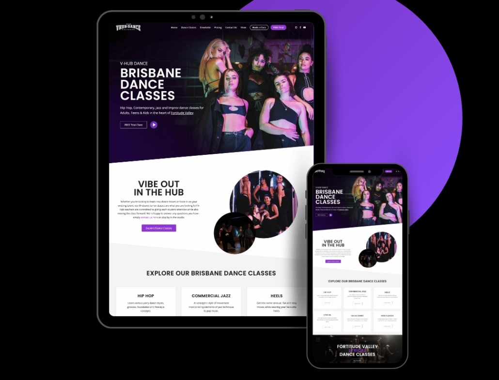
Imagine browsing a website that is visually stunning on a desktop but poorly formatted on a mobile device. This is a sure way to drive potential customers away. By using responsive design, your website will be optimised for better user engagement and improved search engine rankings. With the increasing number of mobile users, responsive design is a must-have for any small business website that wants to stay relevant and competitive in today’s digital landscape.

With over half of all website traffic coming from mobile devices, it's essential to keep a mobile-friendly website design for your business!

Prioritise mobile users

Mobiles dominate internet browsing, and mobile-friendly design is here to stay. Therefore, it’s important than ever to ensure that your website caters to the needs of mobile users. Designing your website with a “mobile-first” mindset means taking into account the unique needs and constraints of mobile devices and prioritising them over traditional desktop design. When you prioritise mobile-first design, your website becomes optimized for mobile users, resulting in increased user engagement, higher conversion rates, and improved search engine rankings.

When building a mobile-friendly website design, it’s essential to consider factors like touch-friendly navigation, which allows users to easily navigate your website using their fingers. This can be achieved by designing large, easy-to-tap buttons and intuitive menus that are easy to navigate. Another crucial factor is choosing fonts and colours that are easy to read and provide a high contrast, making your website accessible and visually appealing for users on the go. If you prioritise the needs of mobile users, you will guarantee that your website optimizes a seamless user experience. This would lead to increased traffic, engagement, and ultimately, success for your small business.

Test, test, test

As a small business owner, you’ve worked hard to create a website that reflects your brand and connects with your audience. But designing a website that works well on all devices can be a challenge. That’s why testing is essential. Not only can testing help you identify potential issues with your website, but it can also give you insights into how users interact with your site on different devices.

Imagine a potential customer trying to access your website on their smartphone, but the website doesn’t load properly. Frustrated, they might leave your website and never return. That’s a lost opportunity for your business. By testing your website on multiple devices and browsers, you can ensure that your website looks and performs well for all users, regardless of the device they’re using.

It’s not enough to simply test your website once and call it a day. It’s vital to frequently test your website to ensure it’s up-to-date and functioning properly with new devices and browsers. By staying on top of the latest trends and developments in mobile-friendly website design, you can help ensure that your website stays ahead of the curve and continues to drive results for your business.

Final Thoughts

In conclusion, creating a mobile-friendly website is a necessity for small businesses in today’s digital age. Moreover, creating a website that is optimized for mobile users is crucial since mobile devices account for half of all website traffic. By prioritising the essentials, you can create a website that not only looks great on all devices. With these tips in mind, small businesses can create a website that ultimately drives more success for their business. So don’t wait, start designing for the future today!

Looking to take your business to the next level with top-notch digital solutions? Look no further than Done Digital! Visit our website today and let’s take the first step together.