As the world becomes increasingly digital, it’s more important than ever for small businesses to have a mobile-friendly website design. In fact, mobile devices now account for over half of all website traffic. If your website isn’t optimised for mobile, you could be missing out on a significant portion of potential customers.
So, how can small businesses ensure that their website is mobile-friendly and ready for the future? Here are some tips to keep in mind:
Keep it simple
In today’s fast-paced digital world, simplicity is not only a key but a necessity for mobile-friendly website design. Your website must be designed with a minimalist approach that makes it easy to navigate and access critical information with minimal clicks. Clear calls-to-action with bold and contrasting colours will make your visitors take action without any hesitation.
Remember, a cluttered website can make your potential customers feel overwhelmed and confused. Moreover, this may ultimately lead to higher bounce rates.
Optimise for speed
Load time is a critical factor that affects the success of your website, especially in the mobile era we live in. A website that loads slowly is a website that is doomed to fail. Mobile users are busy people who expect to find what they need quickly and effortlessly. With this, if your website takes more than a few seconds to load, they will not hesitate to leave and find what they need elsewhere.
To ensure your website is optimised for mobile devices, you must take the necessary steps to minimise load time. There are several ways to do this, including compressing images, minimising code, and reducing the number of HTTP requests. Compressing images without compromising their quality is one of the most effective ways to reduce the file size and improve load time. Minimising code, on the other hand, involves removing unnecessary code and formatting to reduce the file size. This will make your website lighter and more efficient, leading to faster load times.
Use responsive design
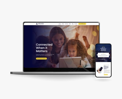
Responsive design is like having a chameleon-like website that adapts and blends seamlessly into any device, making it an indispensable element for mobile-friendly website design. Whether it’s a sleek smartphone or a widescreen desktop, responsive design ensures that your website delivers a consistent user experience across all devices.
Imagine browsing a website that is visually stunning on a desktop but poorly formatted on a mobile device. This is a sure way to drive potential customers away. By using responsive design, your website will be optimised for better user engagement and improved search engine rankings. With the increasing number of mobile users, responsive design is a must-have for any small business website that wants to stay relevant and competitive in today’s digital landscape.
Prioritise mobile users
Mobiles dominate internet browsing, and mobile-friendly design is here to stay. Therefore, it’s important than ever to ensure that your website caters to the needs of mobile users. Designing your website with a “mobile-first” mindset means taking into account the unique needs and constraints of mobile devices and prioritising them over traditional desktop design. When you prioritise mobile-first design, your website becomes optimized for mobile users, resulting in increased user engagement, higher conversion rates, and improved search engine rankings.
When building a mobile-friendly website design, it’s essential to consider factors like touch-friendly navigation, which allows users to easily navigate your website using their fingers. This can be achieved by designing large, easy-to-tap buttons and intuitive menus that are easy to navigate. Another crucial factor is choosing fonts and colours that are easy to read and provide a high contrast, making your website accessible and visually appealing for users on the go. If you prioritise the needs of mobile users, you will guarantee that your website optimizes a seamless user experience. This would lead to increased traffic, engagement, and ultimately, success for your small business.
Test, test, test
As a small business owner, you’ve worked hard to create a website that reflects your brand and connects with your audience. But designing a website that works well on all devices can be a challenge. That’s why testing is essential. Not only can testing help you identify potential issues with your website, but it can also give you insights into how users interact with your site on different devices.
Imagine a potential customer trying to access your website on their smartphone, but the website doesn’t load properly. Frustrated, they might leave your website and never return. That’s a lost opportunity for your business. By testing your website on multiple devices and browsers, you can ensure that your website looks and performs well for all users, regardless of the device they’re using.
It’s not enough to simply test your website once and call it a day. It’s vital to frequently test your website to ensure it’s up-to-date and functioning properly with new devices and browsers. By staying on top of the latest trends and developments in mobile-friendly website design, you can help ensure that your website stays ahead of the curve and continues to drive results for your business.
Final Thoughts
In conclusion, creating a mobile-friendly website is a necessity for small businesses in today’s digital age. Moreover, creating a website that is optimized for mobile users is crucial since mobile devices account for half of all website traffic. By prioritising the essentials, you can create a website that not only looks great on all devices. With these tips in mind, small businesses can create a website that ultimately drives more success for their business. So don’t wait, start designing for the future today!
Looking to take your business to the next level with top-notch digital solutions? Look no further than Done Digital! Visit our website today and let’s take the first step together.



 Done Digital
