No matter the size of your business, I believe we can all agree that not having a website in this day and age is no longer an option. However, not all websites are created equal. A well-designed website will not only look great but should help you capture leads, increase sales and help leverage your time and other resources.
Many small business owners treat their website somewhat like an online brochure with a contact form attached. But it’s the ability to capture leads and predictably turn them into customers that sets a great website apart. And in order to achieve this, we require three things:
Great Content
The content on your website is a crucial element. Providing your visitors with engaging content that captivates, educates and encourages them to take action is a vital part of any good business website. Make the content about your readers, not your business and ensure the jargon and tone of voice you use are consistent and in line with your brand. The goal is not to brag about your business but to truly connect with potential buyers and understand their needs and wants.
Great Design
The “look and feel” of your website says a lot about your business and leaves a lasting impression. It’s also often the first contact your customers have with your business. A lack of consistency and poor layout will result in visitors leaving your website before you even had a chance to tell them what your business is all about. Great design means, your customers can easily navigate your website and find what they’re looking for without getting lost (or frustrated). Again, make sure the colours and fonts you use are in line with your branding. A well-designed website will help you build trust with potential customers and convert better as a result.
A Great Offer
This might be the most important part of any website that most business owners (and even web designers) often overlook. I’m not speaking about your actual product or service offering. What I mean is an offer targeted at your IDEAL CUSTOMERS with the aim to collect their contact details and/or other relevant data. In marketing, we refer to this as “Lead Magnet“. Not everyone who comes across your website for the first time is ready to buy from you. By giving them an opportunity to opt-in for a free download or trial of some sort you can reach out to them multiple times (using email marketing or retargeting ads, for instance) which will significantly increase your chances of making a sale further down the line.
The main goal of every good website should be to build your list.
3 Websites of Local Small Businesses Designed for Growth
Here are three small business websites I designed for local businesses where we have incorporated all three aspects mentioned above. They also make some great examples for when you are ready to give your business’ website a facelift or need help designing one from scratch.
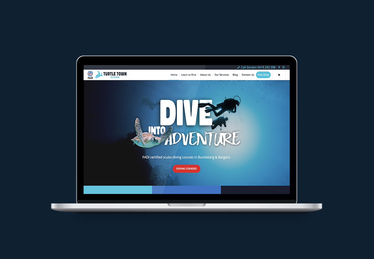
1. Turtle Town Scuba
Turtle Town Scuba is a local scuba diving school in Bundaberg that has built its following using a great online strategy. The website is aesthetically pleasing and easy to navigate. The home page is laid out in a way that allows visitors to easily find what they’re looking for, see the range of diving courses, learn about the instructors and learn more about diving in the Bundaberg Region through featured blog posts. Without being intrusive, the $25 gift card offer makes it easy for new visitors to leave their details and stay connected to the business before leaving the website.
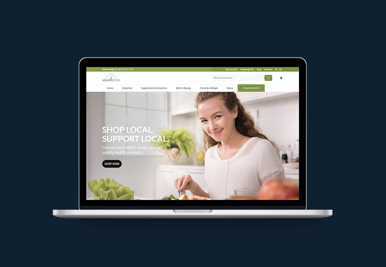
2. Bundaberg Health Foods

The website of Bundaberg Health Foods conveys a clear message, both in terms of content and branding. Users can easily navigate through the different sections of the website, finding what they are looking for quickly and without getting lost or overwhelmed. The website is designed to be completely mobile friendly and displays beautifully across all devices and browsers. A popup captures visitors’ attention and offers them a $10 health food voucher in return for their email address – a fast way to build a loyal following. As an e-commerce business with over 4000 products, we needed to find a way to make product management easy. We integrated with the in-store POS Vend, so that product descriptions and stock levels are always in sync.
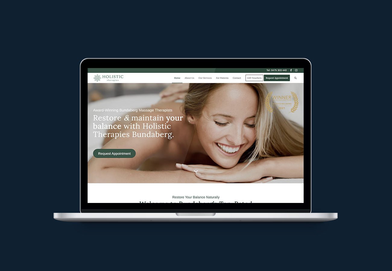
3. Holistic Therapies

One of the biggest mistakes most business owners make is that they ask for the sale too early. The website of Holistic Therapies is designed to educate visitors and offer locals a massage voucher as an incentive to trial the service. I have found that this strategy combined with a good follow-up email sequence can consistently deliver fantastic conversion rates and drive sales. The various articles on the blog assist in answering questions customers have and educate them about the many benefits of massage therapy.
If you would like help with the development and implementation of a sound marketing strategy for your business, let’s have a chat! Book a free strategy call to discuss your business and marketing goals.


